CGT251 Final Project - Character design walk cycle!!!
Sketches are on the post beneath this. TwT~<3
Monday, December 15, 2008
Monday, December 1, 2008
Work in progress - Character design
Monday, November 10, 2008
Kinetic Typography - Why so serious?
Let's just simply say that I did have some amusement making this flash - but the tedious work involved is not...how shall we say, enlightening.
Anyways, without further adeau --
Anyways, without further adeau --
Wednesday, October 8, 2008
Final Interface Designs;
Music Interface Design
 I'm just about ready to collapse onto bed from exhaustion. Committed overkill/berserk/total ripping apart/tearing apart/recreating with this design - using the music "Wandering Sophie" from Howl's moving castle. What's worse, got myself soaked halfway back to the apartments before working on this blasted thing. So not only am I tired, wet, smelly, and miserable, it's nearly 4 in the morning and class starts at 9.
....
I'll have to remind myself to bring my pillow with me when I go to class. x_x;;
Tuesday, October 7, 2008
Update - Photograph Interface Design
Monday, October 6, 2008
Work in progress - Update
Wednesday, October 1, 2008
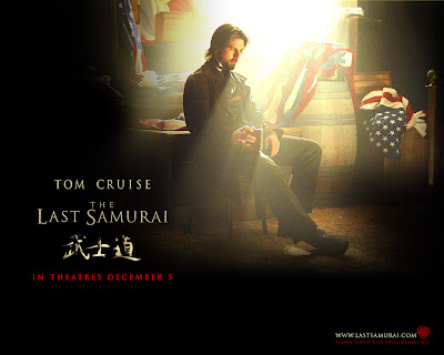
Interface Design 1 - The Last Samurai
Monday, September 29, 2008
Thursday, September 18, 2008
Illustrator Friday - Island theme?!
Thursday, September 11, 2008
The Theme of Clutter --
Wednesday, September 10, 2008
Sunday, September 7, 2008
Final Comprehensive --


Well, the final logo as it is. Rather than the childish look that I noticed in my comprehensive ones I did for my three logos, I figured that some sharp curves and straight lines denote more of a professional look that may portray the message better than just simple curves. Of course, strokes were discarded just because it would interfere on how people would view the logo, creating some obstructions that would create complications.
So to make it simple, direct, and as simplistic to the point - coccoon around the car with dark, saturated color, emphasizing the point. Shield guard with TASI directly painted on the shield to give the message of protection - and some light decorations around the shield, depending on what type of car you want...
Other than that, the output looks better than the last ones. But that's just my personal opinion.
Wednesday, September 3, 2008
The 3 Comprehensive designs for the TASI logo. Keeping the color scheme and design as simple as possible to try and convey the message without getting misunderstood by the audience.
Had two versions with very slight edit - the circular areas that are to depict the active safety systems. It looks fine from the computer, but just in case that people can't see the area well due to the coloring scheme...
Wednesday, August 27, 2008
Monday, August 25, 2008
Subscribe to:
Comments (Atom)


